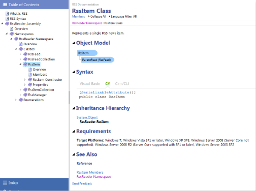
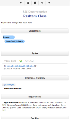
The "Classic" and "Material" Templates in Document! X and HelpStudio Bundle include a responsive output option. Responsive content automatically optimizes its layout when viewed on Tablet and Mobile devices; including a fly out ToC, Index and Search pane, resized / buttonized links that are easier to use on touch devices, reorganized table layouts for narrow browser dimensions, etc.
The screenshots below illustrate the automatically optimized layout for Desktop, Tablet, and Mobile with the Responsive Output feature enabled:
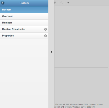
To conserve valuable screen space on tablet and mobile devices the navigation pane is hidden and slides out as an overlay when requested by the buttons in the navigation header, as illustrated in the screenshots below:
Generating content that works well on a range of devices is traditionally a time consuming and complex task and typically requires the generation of multiple outputs. The Responsive Output option in Document! X and HelpStudio Bundle reduces that task to a single option and generates a single output that automatically adapts to the browsing device that is being used.
To enable Responsive Output
- Open the Build Profile editor for the Build Profile you wish to enable Responsive Output for.
- Select the Templates page.
- For each enabled Template, expand the Features section and select the Responsive option.
To try different Responsive Output layouts on a Desktop machine
Document! X and HelpStudio Bundle generates three additional pages when the Responsive Output option is enabled. The three additional pages (variants of the webframe.html main page) force the layout to either Desktop, Tablet, or Mobile rendering modes, allowing you to test how your content looks and behaves when viewed on Desktop, Tablet, and Mobile devices.
The generated pages are webframetablet.html, webframemobile.html, and webframedesktop.html. Open one of those pages to force a particular layout for testing purposes.


